Art Director / NYC
GEE & T
Branding, Logo Development, Package Design, Graphic Assets & Layouts


Photoshoot concept is editorial action shots, for use in traditional and digital marketing
Package design for each flavor
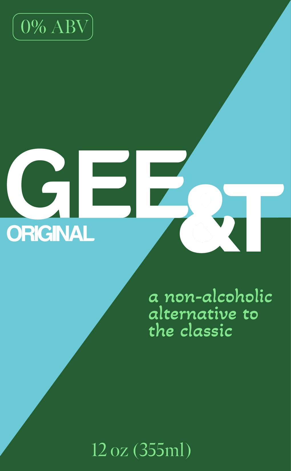
emphasizes clean lines and shapes for a graphic, bold layout that will pop on the shelf. "non-alcholic" is stated in the tag line alongside "0% ABV" to ensure clear communication of product.


Web mockups continue the graphic, two-tone design elements from the cans exterior.
Logo development - classic with a twist. Using Helvetica Bold as a base, a modern update was given by replacing the character edges with unexpected, soft curves to offset the harsh lines.


#245E31
#6BC9D6
#83E58C
#245E31
#6BC9D6
#83E58C
#245E31
#6BC9D6
#83E58C
Each flavor profile features its own three color palette to work within the brand's graphic signature.

GEE & T is a premium canned mocktail brand offering a non alcoholic alternative to a gin & tonic. The brand is focus on presenting an energetic, modern twist on the classic cocktail - alcohol free and in a variety of exciting and bold flavors. This is not your father's gin & tonic.


About Matthew
Matthew Wallace is a NYC native, designer and travel lover. With a background in print and fashion design he brings a keen eye and strong visual identity to all his creative projects.
Contact